The “Brainstorm” Behind Vfcd 2022 Key Visuals: Vibrant Butterfly Wings Lead The Way For Change
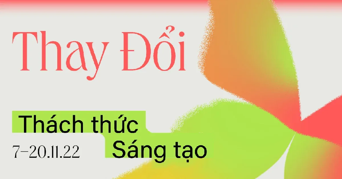
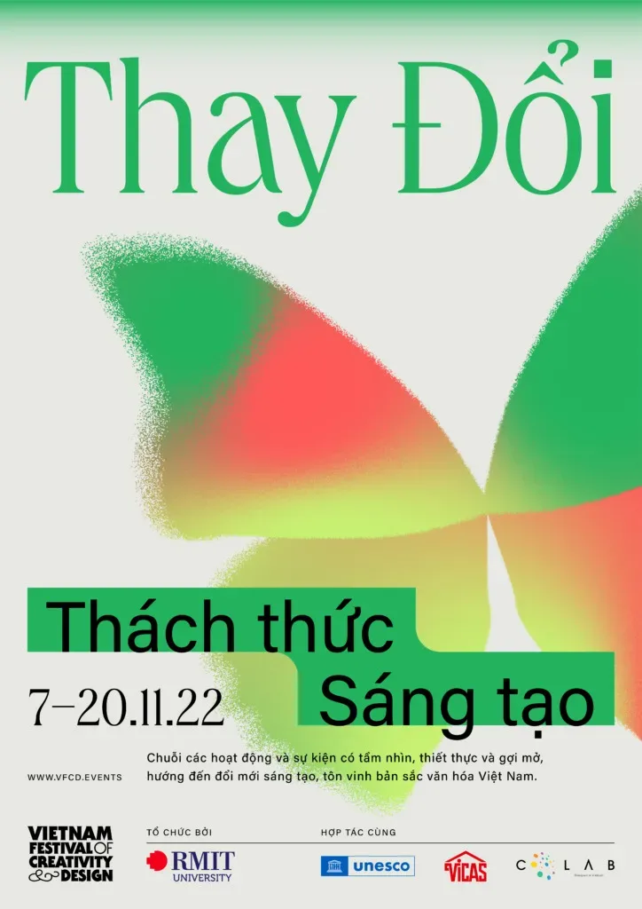
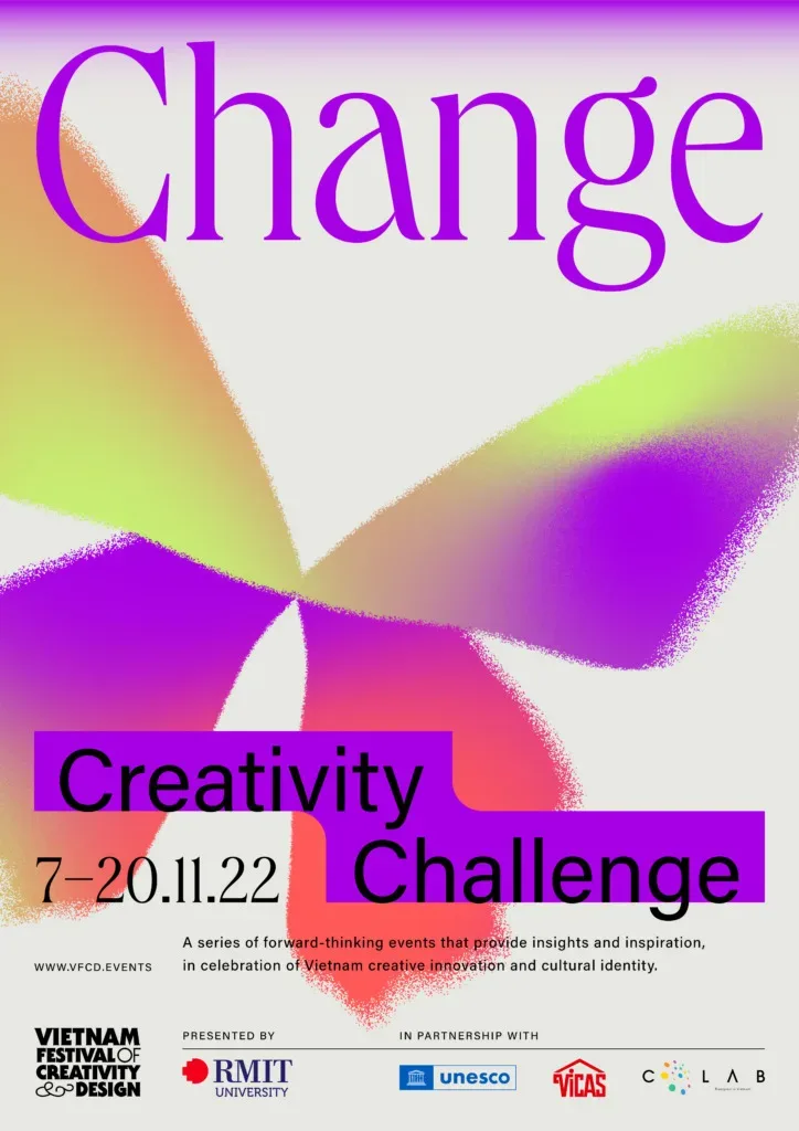
The key visual (KV) of Vietnam Festival of Creativity & Design 2022 (VFCD 2022) this year has been officially revealed: vibrant butterfly wings with the ability to transform their colours, shapes, and patterns… The butterfly wings represent the spirit of 2022 that VFCD aims towards: daring to accept challenges and change for relentless creativity.
The design brief for Behalf Studio – VFCD’s creative partner – was among the keywords of “minimal, fresh, dynamic, sharp, inspiring and call-to-action”. These words were later re-phrased for better expression into “approachable, innovative, dynamic, contemporary, emotion-provoking and impactful”.
Yet it is not easy for these words to “emerge as” visuals. Especially when the goal of this year’s KV is to create a difference from those from the other years, while allowing for diverse applications and strong impressions at first sight.
If it were you, with a “brief” full-of-difficult-keywords as such, what would you do?
Designing key visual: an intricate connection between logic and emotion
Do you know that before the organisers decided on the final design of the KV, there had been five directions that already took shape with distinctive narratives? The first was inspired by the network of rivers, then the simple yet creative shapes of each letter in the word “change”, and the marvelous inventions of humans… Even the image of the butterfly at first was just one of the visual leads in the concept “Change is the Nature of Life”, which included a series of signature features of other creatures in nature, such as the snakeskin (snake), the tentacles (octopus), the shell (hermit crabs)…
Then why were the butterfly wings chosen at last?
In reality, to make a decision on the visual metaphor for the key visuals, one will need to consider not only emotions and intuition, but also logic and reason.
According to Behalf Studio, the butterfly wings could meet these two criteria better than the rest.
With approximately 170,000 species and billions of individuals, the butterflies were known for their various shape-shifting methods to coexist with nature. They are diverse in shapes, patterns and combinations of colours.
They also bear multiple layers of meaning in various disciplines, an example being the butterfly effect, in psychology, a symbol of fragility and changeability… in literature, art, music, film, etc.
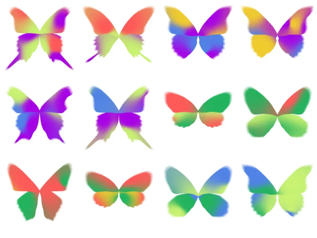
Sharing their thoughts on the creative process for the KV this year, Behalf Studio said that the team experimented with multiple approaches for the butterfly design, such as 3D, hyperrealism, and extreme visual abstraction… Finally, they arrived at a balanced showcase of dimensionality, treatment and complexity in the final visuals like you see here.
What about you, how do you feel about VFCD key visuals this year?